How to transform a complex website in a unique central web platform
How to transform a complex website in a unique central web platform
Wageningen University & Research (WUR)
Wageningen University & Research (WUR)
04
04
04
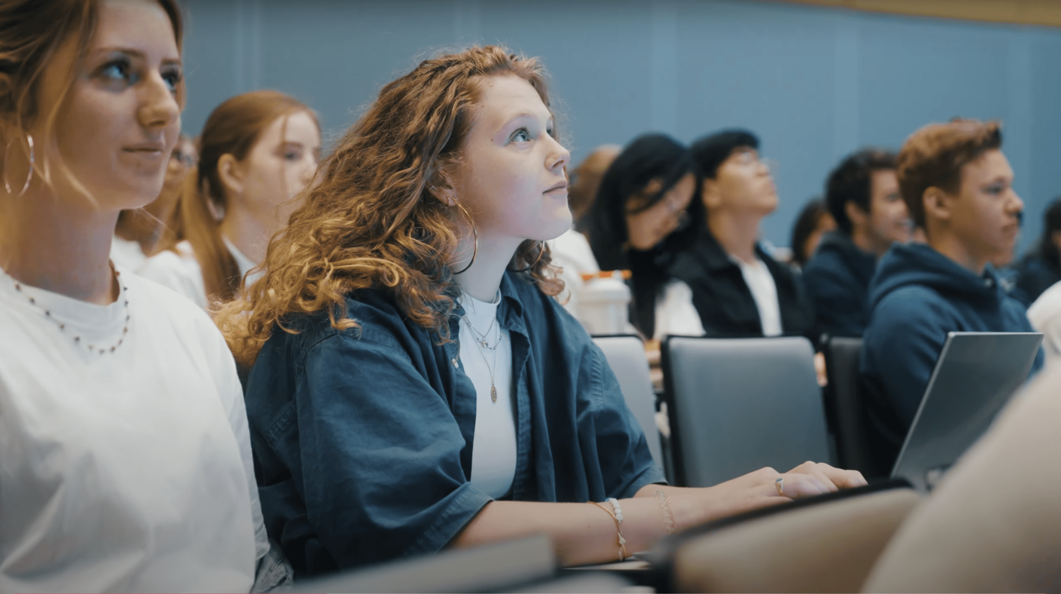
Wageningen University & Research is globally recognised for its research and education in the fields of food, agriculture and living environment. The university collaborates with governments, businesses and knowledge institutions around the world, attracting students and researchers from dozens of countries.

Scope
Concept, visual design and motion direction for a new headless Drupal platform with AI-powered search.
Role
Digital art director
Motion designer
©
2025

Challenge
Challenge
WUR is globally respected for food, agriculture and life sciences, but its website had grown into a maze: separate sub-sites for different audiences, inconsistent pages, and a navigation that didn’t always make sense. Prospective students even needed their own standalone site because the main platform couldn’t serve them.
Meanwhile, Selmore (branding agency) had just given WUR a new brand idea, “Full of Life”, with an organic visual device, a new palette and a new tone of voice. The platform still looked like the old, rational institution.
My brief: turn a brand story into a living digital experience. The site had to feel like WUR’s new identity while staying fast, accessible and credible for a scientific audience.

Insight
Insight
Selmore’s identity is built on a simple observation: life is never static, never angular and never the same twice. That is a brand idea, but it is also a direct instruction for interface design.
Websites are usually the opposite of this. They are rigid grids, uniform components and instant state changes. If we only borrowed the colours and the logo, the site would carry the identity without embodying it.
The second insight was about audiences. WUR speaks to students, researchers, partners and employees, and each needs a different tone. The challenge was to let them share one platform without it feeling like four websites stitched together.
Idea
Idea
One platform, many forms of life.
The idea was to treat the brand’s organic shape as a system, not a decoration: one recognisable device that changes form, colour and scale depending on who is looking and what they need. Structure stays calm and consistent, while the expression stays alive.
Calm structure, living surface. Clear navigation and a strict content hierarchy underneath; organic shape, colour and imagery on top.
Curiosity as a visual language. Close-ups, zoom-ins and unexpected crops, so the interface feels like looking through a lens.
One identity, audience-aware. A shared foundation, with colour as the signal for different audiences.
Art direction and design principles
Art direction and design principles
From circle to organic shape.
The old WUR brand used a geometric circle. Selmore evolved it into an asymmetric, organic form. I translated it into a flexible web asset: used whole as a hero element, zoomed in as a crop or frame, and filled with imagery. It is never a perfect circle.
Photography as tactile evidence.
Macro textures, unexpected perspectives, people in the field with mud on their boots. Imagery is cropped inside the organic shape so the brand device and the content become one object.
Motion principles
Selmore’s guideline gave me the starting point: the visual device “moves when possible and is not always the exact same shape.” Motion became the way the site proves it is alive.
Breathe, don’t bounce. Movement should feel biological: slow, eased, slightly irregular. Nothing mechanical or snappy.
Never the same shape twice. The organic form morphs gently between states, so it feels like something growing rather than a looping animation.
Zoom is curiosity. Scale changes and crops echo looking closer at something, using transitions that move from the whole to the detail.
Always optional. Motion respects reduced-motion preferences, and every animated element has a calm, static equivalent.

Want to get in touch?
Drop me a line.
Want to get in touch? I like meeting people across industries.
Reach out if you want to talk design leadership, mentorship, or football.
©2026 Jeremi Flor

Want to get in touch?
Drop me a line.
Want to get in touch? I like meeting people across industries.
Reach out if you want to talk design leadership, mentorship, or football.
©2026 Jeremi Flor
Want to get in touch?
Drop me a line.
Want to get in touch? I like meeting people across industries. Reach out if you want to talk design leadership, mentorship, or football.
©2026 Jeremi Flor