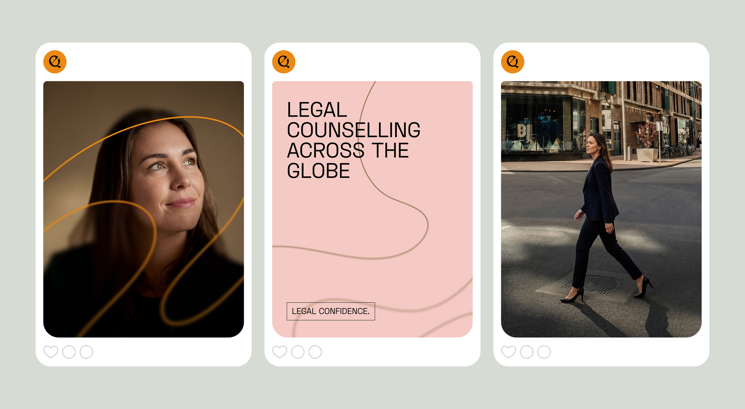
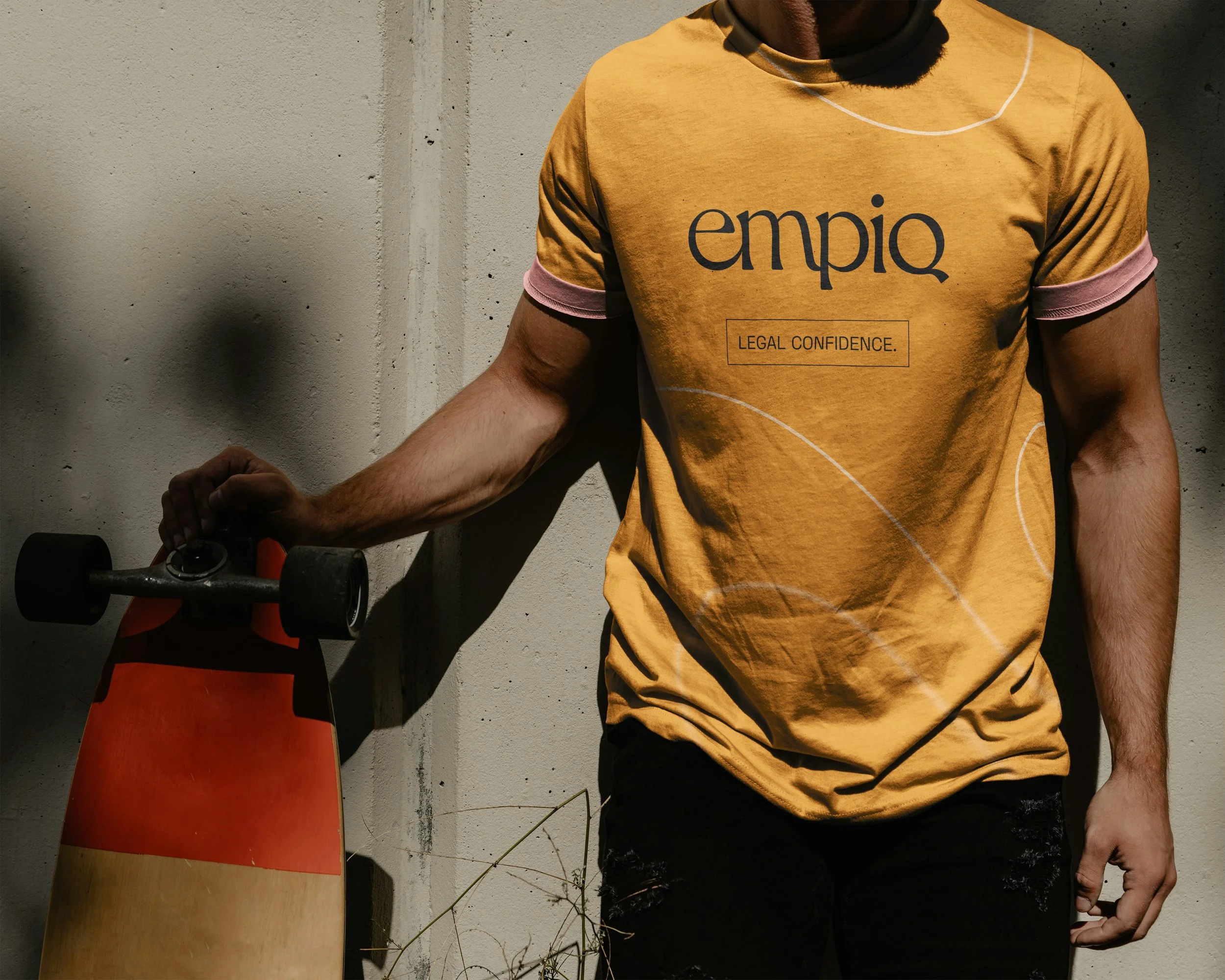
Leading a complete brand overhaul for a next-generation law firm, spanning identity, art direction and website design.
Role
Art Director and motion designer
Led the end-to-end brand redesign of Empiq’s brand and digital ecosystem across offline media, and web platforms.
Scope
Led design across brand and digital platforms
Logoword and logomark creation
Defined visual direction and brand design system
Insight
Legal can be simple and efficient. When ever, where ever. Empiq dreams of a world in which entrepreneurs are not hindered by legal pitfalls and obstacles, but where they can rely on the convenience, wisdom and organisation of smart legal counsels.
Idea
Empiq is reassuring and skillfull without becoming intimidating. Empiq is empathetic, accessible, and combines it with wisdom and intelligence. It translates complex legal matters into understandable language. Empiq gives legal confidence.
Art direction
EMPIQ is warm, but sharp. Contemporary, but not trendy. Professional, but not stiff. EMPIQ is a kind, wise friend who stands by you in all your endeavours. These are the words that needed to be reflected in the new art direction of Empiq.
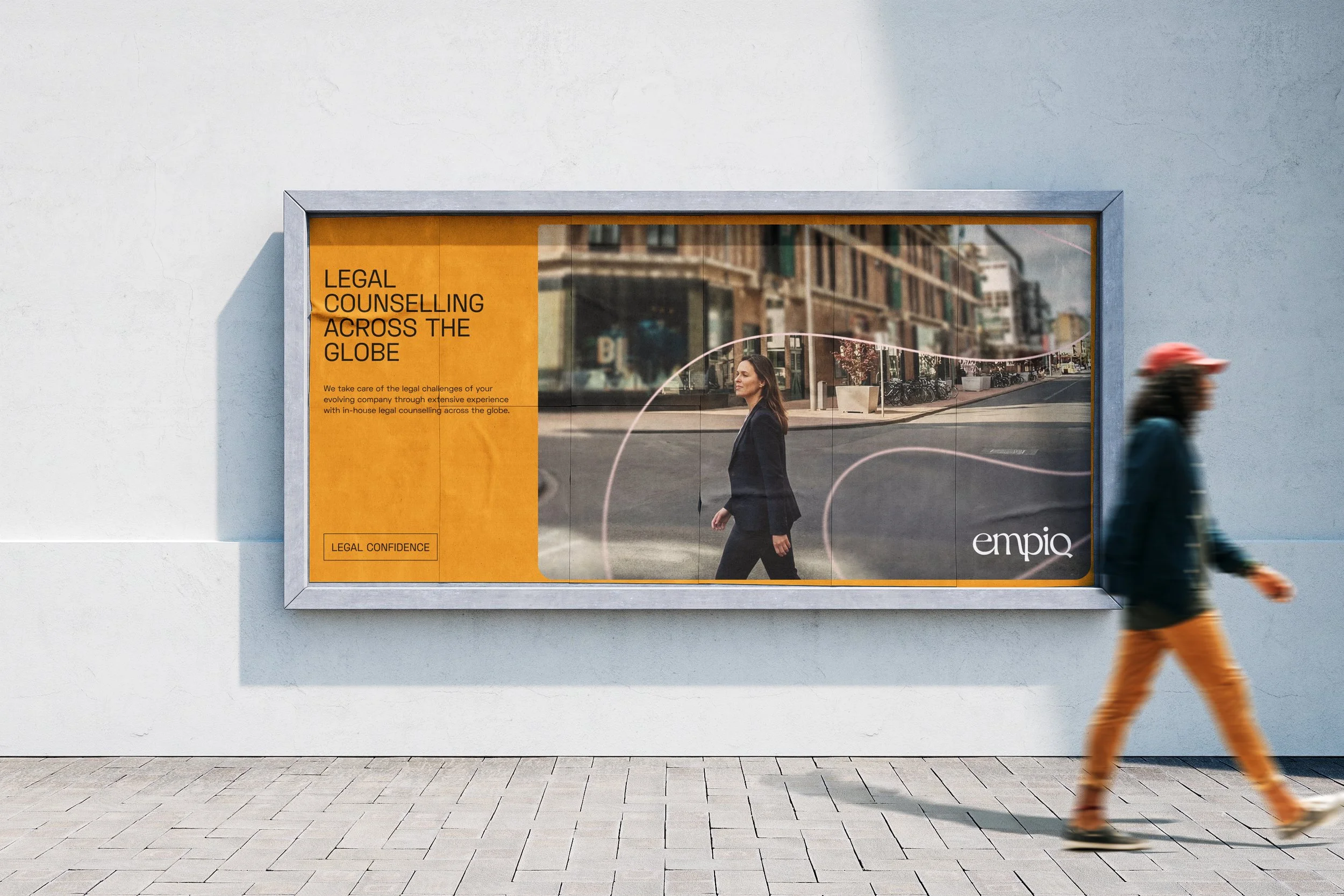
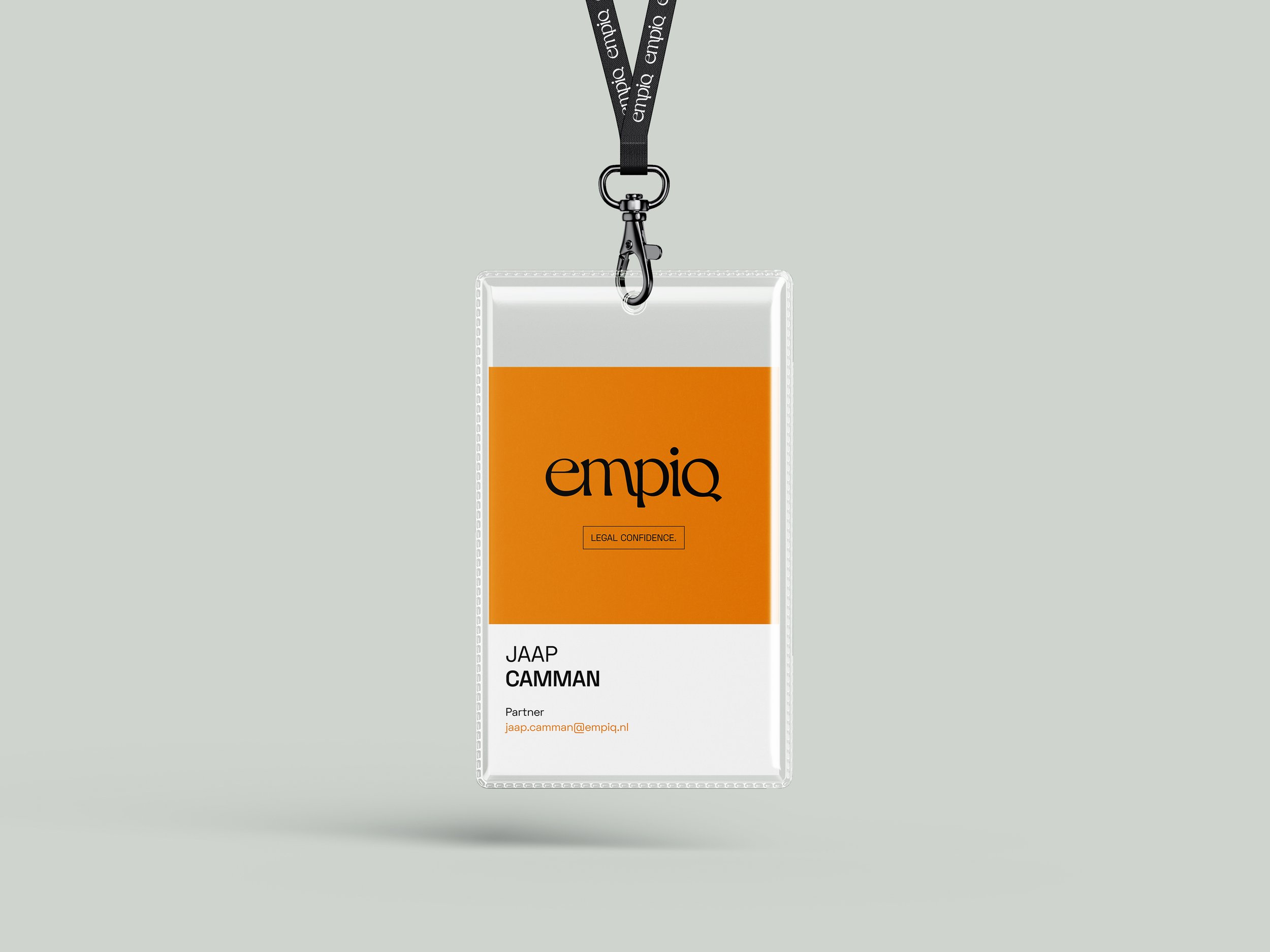
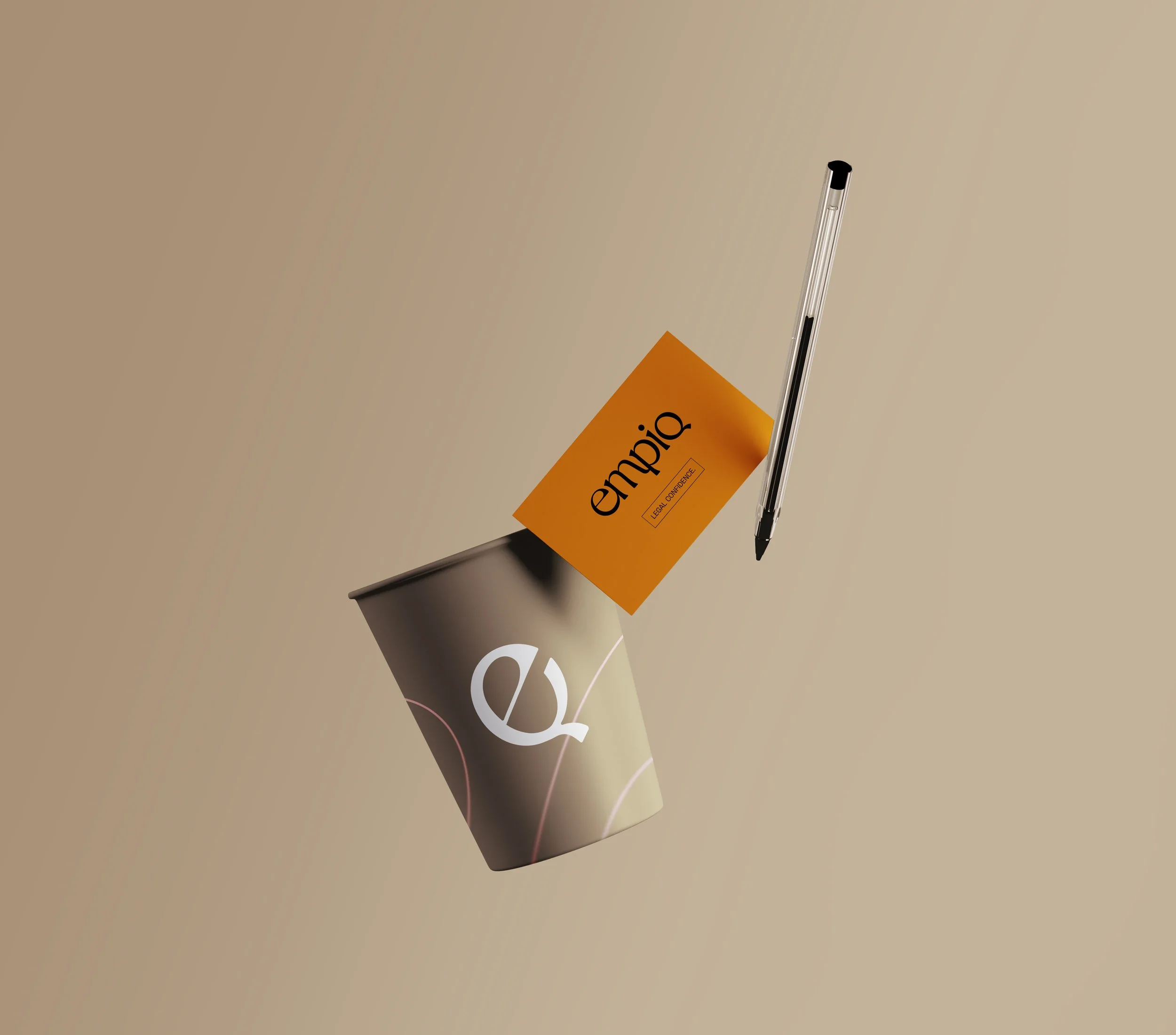
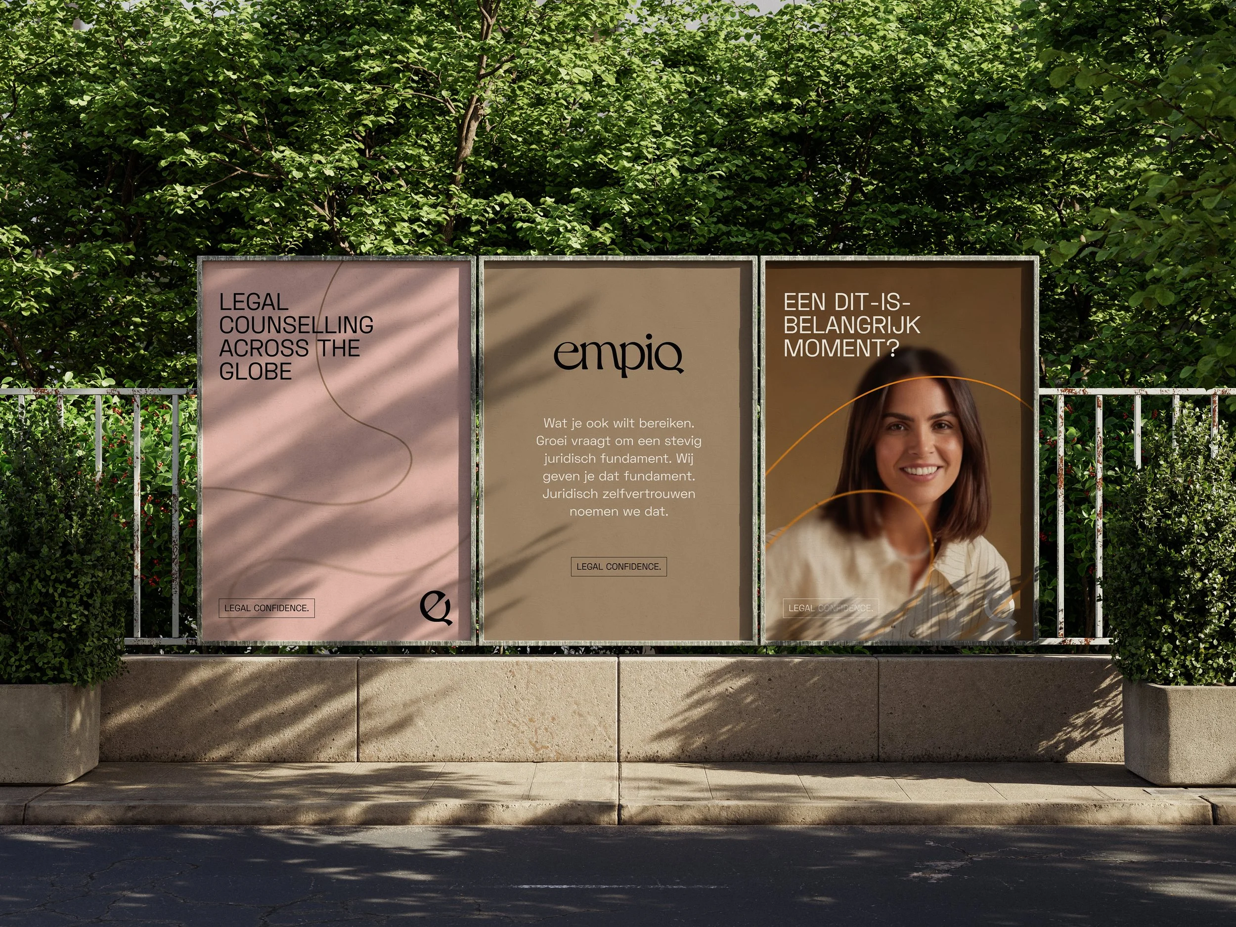
Colour, professional and confident complemented by warm accent hues.
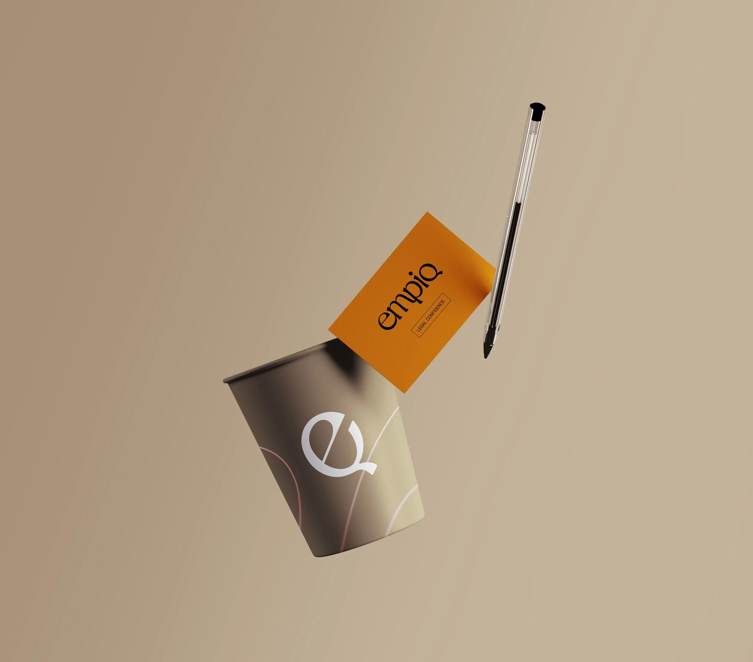
The primary Empiq colours consist of refined confident neutrals as the base, complemented by warm hues for added humanness. Orange, black and taupe predominantly compose the colour balance (approximately 70%). Silver green and pink tones are sparingly used as subtle accents to attract attention.
Typography, assured, confident and clear.
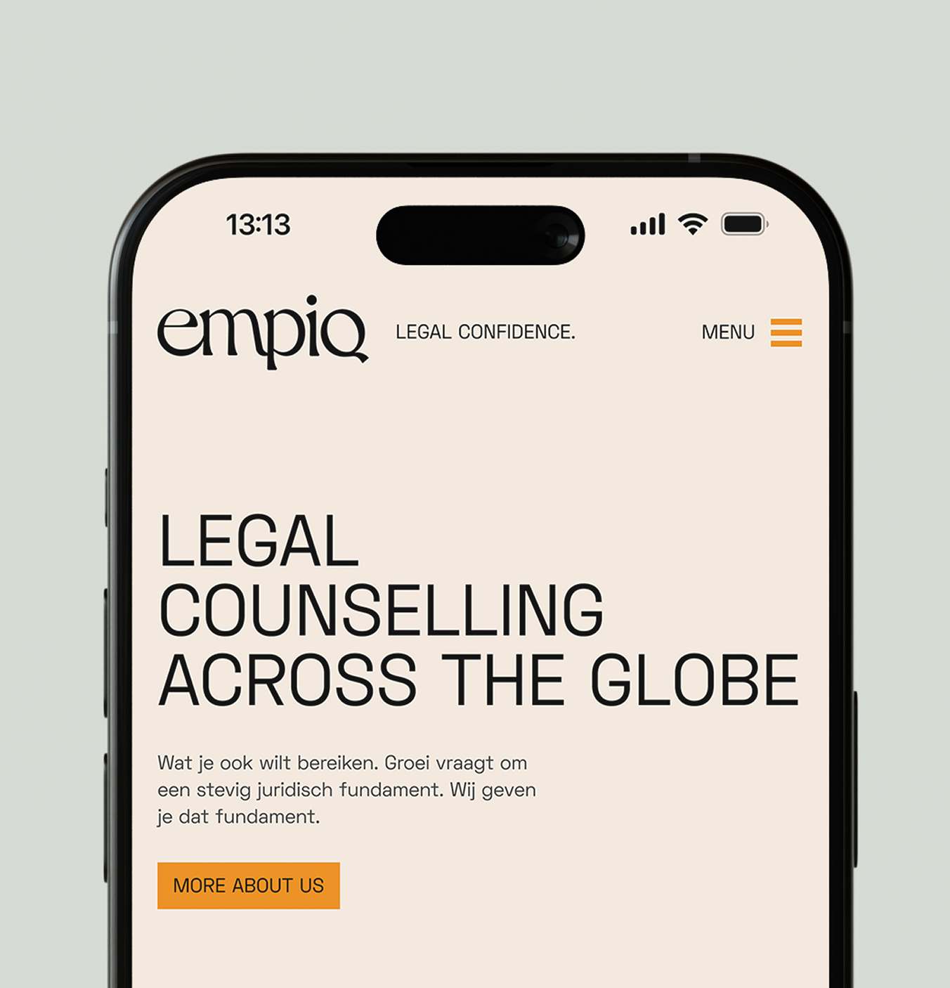
Space Grotesk combines the rational, grid-based structure of geometric sans-serifs with subtle humanist touches, which make it feel less cold and more readable. It feels modern, approachable, and versatile.
Dahlia is the word-mark font. Its usage will be minimal, used on long paragraphs of texts as in small sizes it can quickly become ineligible.
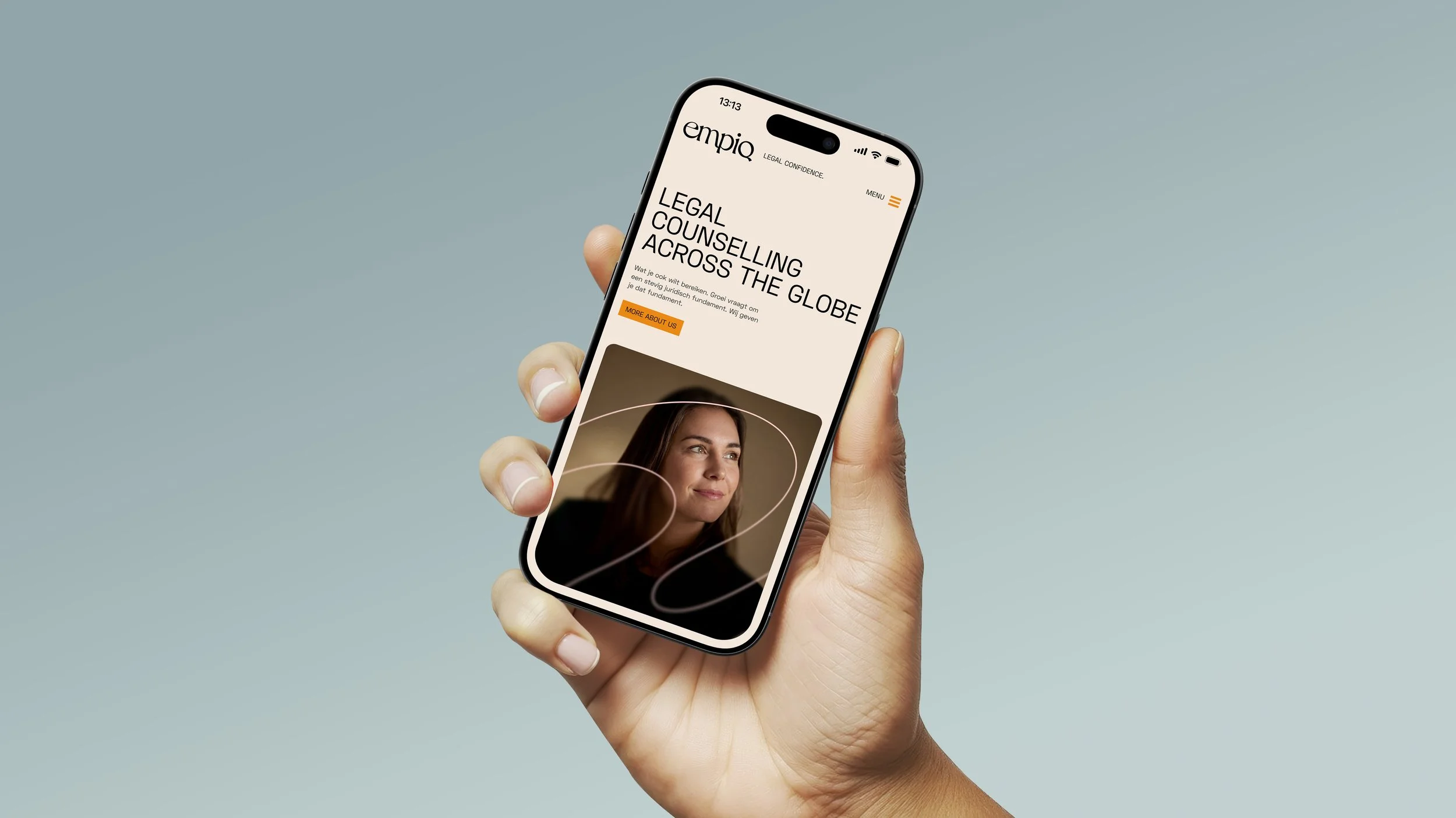
Graphics, lines and blurs to bring clarity
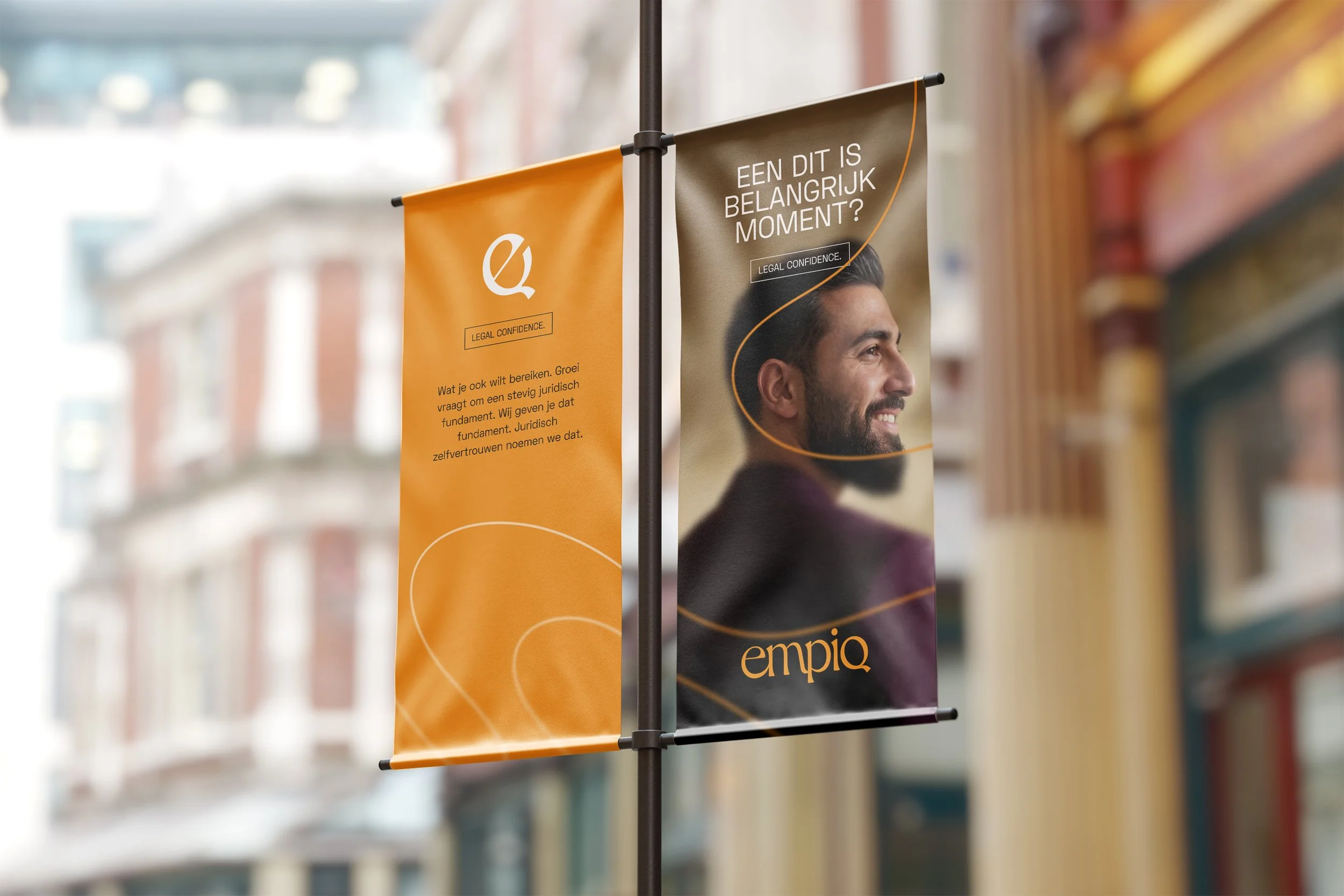
Lines are derived from the quirky letter forms of Dahlia typeface , they are used to direct the eye and create subtle movement. On photography lines act like a mask to create a focus point, and reveal a feeling of clarity for Empiq’s client.
Motion
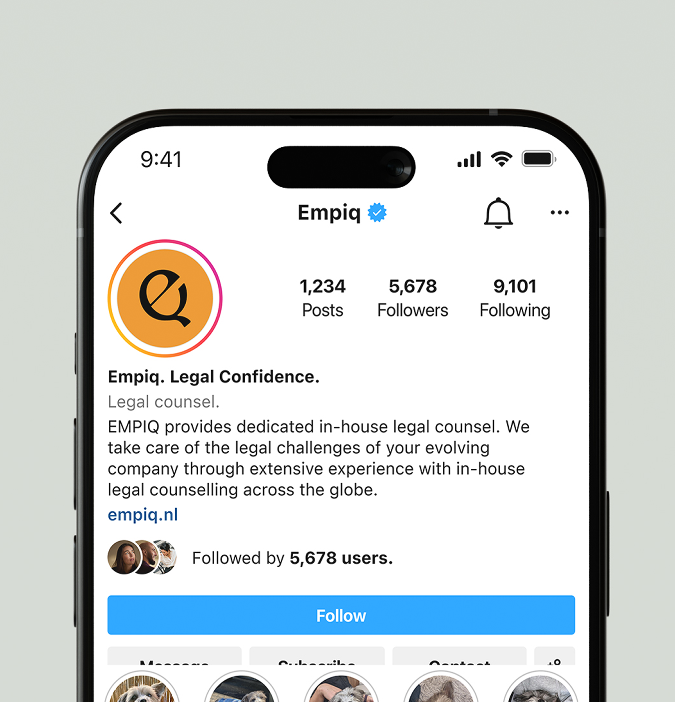
The Empiq motion language adds subtle but distinctive branded emotion to the overall professional but warm visual language.